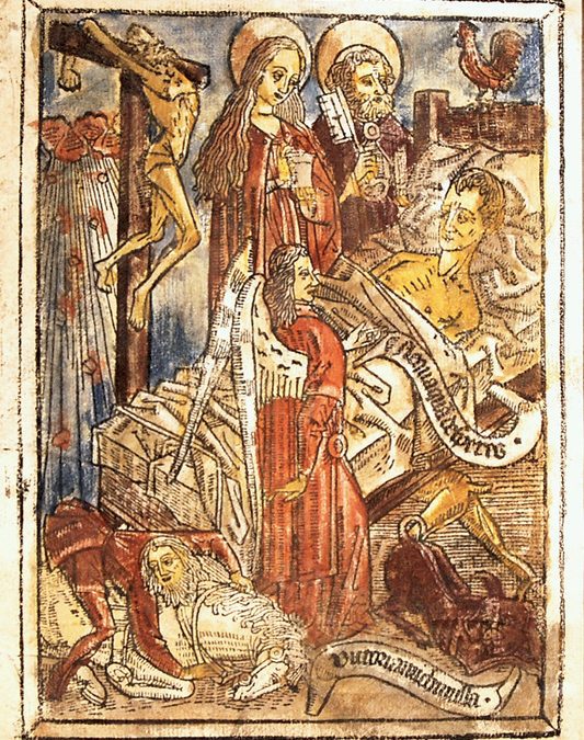
This is one of our most exciting recent purchases, a hand-coloured leaf from a fifteenth-century block book known as the Ars Moriendi (The Art of Dying).
Book technology and the transition between script and print are special interests of mine, so I was enthusiastic when this item arrived at the shop. My modern literature colleague challenged me to explain was so special about it, and the first thing that came to mind was:
I know. Comparing a fifteenth-century book to a defunct home video technology from the era of leotards and big hair is a bit underwhelming. But they’re both part of a long tradition of semi-failed innovations that are interesting for what they can tell us about the history of technological development. In the case of Betamax, social, legal, and technological issues made the system obsolete nearly as soon as it got off the ground, giving the advantage to the rival VHS format, but leaving a legacy that is still useful in understanding the ways innovation occurs. Likewise, the lasting value of block books rests in what they can tell us about printing and the consumption of texts during the late middle ages.
Block books were a sideline in the world of early printing, appearing concurrently with Gutenberg’s invention in the 1450s and 60s. Movable type and the printing press had their origins in metalworking and wine pressing. Block books, on the other hand, developed from the use of wood engravings to cheaply and quickly print fabrics, devotional items, and playing cards. Each block book was composed of individual prints that were produced by rubbing a wood engraving against paper, and they were often hand-coloured. What little text was included was usually incorporated directly into the engraving, a delicate and time-consuming process, but worthwhile because the prints could be mass produced without the capital outlay required for type.
Most block books were simplified versions of older texts that had circulated as manuscripts. The Ars Moriendi is a guide to dying righteously by avoiding sins such as despair, pride and impatience on the deathbed. It’s images are first recorded in a manuscript from the 1420s (today held at the Welcome Library), which were later engraved by an anonymous artisan from the upper Rhine. Several versions exist, and our example is particularly rare as it is one of only two leaves known to survive from this edition. The illustration on this particular leaf is the ninth in a series of eleven, showing the dying man protected from despair by visions of the crucifixion, Mary Magdalene, and Saint Peter. Other illustrations from the same series depict demons clamoring for control of the man’s soul.
Like this one, most block books were religious and didactic in nature. The popular Danse Macabre image cycle, which depicts death taking people from different ranks of life, appeared frequently in manuscripts and artwork and also became a block book. The Apoclyapse of John was adapted as a block book, as was the entire Bible, compressed into about 40 engraved pages known as the Biblia Pauperum, or the Poor Man’s Bible. The only block book without images was a version of the popular Latin grammar of Donatus.
What was the audience for books of this nature? Block books were ephemeral items and few have survived, so we have less evidence for their use than we do for other types of texts. But it’s reasonable to assume that the were produced for a popular audience, and the centrality of images over text indicates that they would have been accessible even to those with low literacy skills. They certainly had religious and educational intentions, but it’s likely that people also enjoyed the vivid images for their own sake, and the leaves could conceivably have been separated and displayed.
Block books were produced in significant quantities for only a few decades, with most printed in northern Europe during the 1460s. Their numbers diminished significantly in the latter decades of the century, replaced by growing numbers of books, pamphlets and broadsides that combined movable type with woodcuts. Blockbooks had a short lifespan, but they are important as an indicator of the period’s demand for texts. Far from the stereotypical image of ignorant dark age peasants, medieval laypeople were interested in using and owning books for the same reasons that we are – for education, entertainment, and as marks of social status. Blockbooks were a way that the middle and lower classes could participate in the expansion of book culture during the period when printed texts were still largely out of their reach.
Marching As To War is our fifth e-catalogue, comprising 90 items on warfare throughout history. Below is a small selection.
VILLARI, Luigi. Fire and Sword in the Caucasus. London: T. Fisher Unwin, 1906
Octavo. Original red pictorial cloth, title gilt to spine and upper board with “asiatic” silhouette skyline to both, top edge gilt, others uncut. Frontispiece and 63 other plates from photographs by the author. A touch sunned on the spine, light marginal foxing, but overall a very nice copy. £375
First and only edition.OAKESHOTT, Ronald Ewart. The Archaeology of Weapons. Arms and Armor from Prehistory to the Age of Chivalry. Frederick A. Praeger, New York, 1960
Octavo. 360pp. Frontispiece and 22 other plates, line-drawn illustrations to the text, maps to the endpapers. Very good in the original red and black cloth in slightly rubbed dust jacket, a little split on the fold of the front turn-in. £65
First US edition, same year as the first UK.MILLARD, Oscar E. Uncensored. The True Story of the Clandestine Newspaper “La Libre Belgique” published in Brussels during the German Occupation. London, Robert Hale and Company,
Octavo, original orange cloth, title gilt to spine, orange top-stain. In the dust jacket. Portrait frontispiece and 15 other plates. Light toning, else very good in slightly rubbed and soiled jacket, a couple of chips at the top edge, some pencil annotations, but pictorially and textually complete. £150
First edition. A far from uncommon book, but genuinely scarce in the extremely stylish Leslie Holland jacket.GUEVARA, “Che”. Guerrilla warfare. New York: Monthly Review Press, 1961
Octavo. Original grey cloth, title in black to spine. In the dust jacket. A very sharp copy in a slightly toned, unclipped, jacket. £85
First edition in English. Excellent copy of this influential text.SASSOON, Siegfried. Memoirs of an Infantry Officer. By the Author of Memoirs of a Fox-Hunting Man. Fourth Impression. London, Faber & Faber Limited, 1930
Octavo, original mid-blue cloth, title gilt to spine. In the dust jacket. Cloth a little mottled, some light foxing particularly to the endpapers, else very good in a pictorial jacket, a little rubbed, a touch sunned at the spine and with a couple of minor blemishes, but complete and visually striking. £675
First edition, fourth impression, a month after the first.VIRILIO, Paul. Bunker Archéologie. Paris: Centre de Création Industrielle, Centre Georges Pompidou, 1975
Small square quarto. Original stiff card wraps with wide French-fold turn-ins. Profusely illustrated from Virilio‟s photographs Wraps very slightly yellowed at the edges, and just a touch chafed, particularly on the spine edges, but overall a very good copy. £400
First edition. Catalogue for the Exhibition of Virilio’s photographic studies of the bunkers around the Western and Northern coasts of France.(FIRST WORLD WAR) Halt! Who goes there? London: Published by the Parliamentary Recruiting Committee… Poster No. 60. Printed by Hill, Siffken & Co. (L.P.A. Ltd.), Grafton Works, 1915
Three colour lithographic recruiting poster ( 1000 × 615 mm) Striking image of a sentry with bayonet fixed, silhouetted against a yellow sky streaked with grey clouds, figure and background in maroon, text in bold white letters. Light creases from old folds, some mild off-setting from where folded, but overall very good indeed. £300
Extremely well-preserved example.
As bibliophiles, how often do we stop to consider the ways sightless people experience books and reading? Prior to the mid-nineteenth century few options existed for the blind; several systems of raised lettering had been developed, but they were complicated and difficult to learn. Meanwhile, the growth of literacy and the media during the industrial revolution led to an increased demand for texts of all types, including those accessible to the blind.
William Moon, born in 1818, contracted smallpox as a young child and by age 22 had lost his sight completely, which ended his dream of entering Holy Orders. Frustrated by the quality of the embossed reading systems he tried, and eager to improve worldwide literacy and access to the Bible, he set about developing his own system based on roman lettering. Moon’s system was easy to master, particularly for those who had learned to read before they lost their sight, and it became very successful. Below is an example of the word ‘book’ in Moon script demonstrating how close the letters are to the roman forms.
Demand for these materials was high, and Moon began printing a monthly magazine and other booklets. He also traveled extensively, setting up presses and teaching others to use his system. His great ambition, however, was to print the entire Bible. Hindered by a lack of type, he experimented with stereotyping. Financial assistance was provided by the philanthropist Sir Charles Lowther, who had also been blinded in childhood and whose mother had imported some of the first embossed books into England. Moon soon learned to produce stereotyped plates at a sixth of the normal price and in 1848 began printing chapters of the Bible–it would total 60 volumes in all, each one loosely bound with a guide on the cover.
Engraving of a man and child reading Moon script.
X, Y, and Z, from the tutorial.
Below, the back of the embossed pages:
The attributes that made Moon’s books successful also made them impractical, as they utilized large letters that could only be printed on heavy paper on single-sided pages. This copy of part I of the Gospel of Matthew measures 378 × 273 mm and is 40 mm thick, far larger than the same amount of printed text. The size of the books made them impractical to store and the loose binding meant that copies deteriorated quickly. This intact volume, stereotyped by Moon himself in 1848 with a cover dated to 1859, is a rare specimen.
The introduction of Braille in 1870 marked the beginning of the end for Moon’s script, but recent technology has solved the problem of its unwieldiness and lead to renewed interest in the system, particularly for individuals who have lost their sight after learning to read and those who have difficulty reading Braille. You can read more about the Moon system at the website of the Royal National Institute for the Blind and this William Moon website.

 VILLARI, Luigi. Fire and Sword in the Caucasus. London: T. Fisher Unwin, 1906
Octavo. Original red pictorial cloth, title gilt to spine and upper board with “asiatic” silhouette skyline to both, top edge gilt, others uncut. Frontispiece and 63 other plates from photographs by the author. A touch sunned on the spine, light marginal foxing, but overall a very nice copy. £375
First and only edition.
VILLARI, Luigi. Fire and Sword in the Caucasus. London: T. Fisher Unwin, 1906
Octavo. Original red pictorial cloth, title gilt to spine and upper board with “asiatic” silhouette skyline to both, top edge gilt, others uncut. Frontispiece and 63 other plates from photographs by the author. A touch sunned on the spine, light marginal foxing, but overall a very nice copy. £375
First and only edition.
 OAKESHOTT, Ronald Ewart. The Archaeology of Weapons. Arms and Armor from Prehistory to the Age of Chivalry. Frederick A. Praeger, New York, 1960
Octavo. 360pp. Frontispiece and 22 other plates, line-drawn illustrations to the text, maps to the endpapers. Very good in the original red and black cloth in slightly rubbed dust jacket, a little split on the fold of the front turn-in. £65
First US edition, same year as the first UK.
OAKESHOTT, Ronald Ewart. The Archaeology of Weapons. Arms and Armor from Prehistory to the Age of Chivalry. Frederick A. Praeger, New York, 1960
Octavo. 360pp. Frontispiece and 22 other plates, line-drawn illustrations to the text, maps to the endpapers. Very good in the original red and black cloth in slightly rubbed dust jacket, a little split on the fold of the front turn-in. £65
First US edition, same year as the first UK.
 MILLARD, Oscar E. Uncensored. The True Story of the Clandestine Newspaper “La Libre Belgique” published in Brussels during the German Occupation. London, Robert Hale and Company,
Octavo, original orange cloth, title gilt to spine, orange top-stain. In the dust jacket. Portrait frontispiece and 15 other plates. Light toning, else very good in slightly rubbed and soiled jacket, a couple of chips at the top edge, some pencil annotations, but pictorially and textually complete. £150
First edition. A far from uncommon book, but genuinely scarce in the extremely stylish Leslie Holland jacket.
MILLARD, Oscar E. Uncensored. The True Story of the Clandestine Newspaper “La Libre Belgique” published in Brussels during the German Occupation. London, Robert Hale and Company,
Octavo, original orange cloth, title gilt to spine, orange top-stain. In the dust jacket. Portrait frontispiece and 15 other plates. Light toning, else very good in slightly rubbed and soiled jacket, a couple of chips at the top edge, some pencil annotations, but pictorially and textually complete. £150
First edition. A far from uncommon book, but genuinely scarce in the extremely stylish Leslie Holland jacket.
 GUEVARA, “Che”. Guerrilla warfare. New York: Monthly Review Press, 1961
Octavo. Original grey cloth, title in black to spine. In the dust jacket. A very sharp copy in a slightly toned, unclipped, jacket. £85
First edition in English. Excellent copy of this influential text.
GUEVARA, “Che”. Guerrilla warfare. New York: Monthly Review Press, 1961
Octavo. Original grey cloth, title in black to spine. In the dust jacket. A very sharp copy in a slightly toned, unclipped, jacket. £85
First edition in English. Excellent copy of this influential text.
 SASSOON, Siegfried. Memoirs of an Infantry Officer. By the Author of Memoirs of a Fox-Hunting Man. Fourth Impression. London, Faber & Faber Limited, 1930
Octavo, original mid-blue cloth, title gilt to spine. In the dust jacket. Cloth a little mottled, some light foxing particularly to the endpapers, else very good in a pictorial jacket, a little rubbed, a touch sunned at the spine and with a couple of minor blemishes, but complete and visually striking. £675
First edition, fourth impression, a month after the first.
SASSOON, Siegfried. Memoirs of an Infantry Officer. By the Author of Memoirs of a Fox-Hunting Man. Fourth Impression. London, Faber & Faber Limited, 1930
Octavo, original mid-blue cloth, title gilt to spine. In the dust jacket. Cloth a little mottled, some light foxing particularly to the endpapers, else very good in a pictorial jacket, a little rubbed, a touch sunned at the spine and with a couple of minor blemishes, but complete and visually striking. £675
First edition, fourth impression, a month after the first.
 VIRILIO, Paul. Bunker Archéologie. Paris: Centre de Création Industrielle, Centre Georges Pompidou, 1975
Small square quarto. Original stiff card wraps with wide French-fold turn-ins. Profusely illustrated from Virilio‟s photographs Wraps very slightly yellowed at the edges, and just a touch chafed, particularly on the spine edges, but overall a very good copy. £400
First edition. Catalogue for the Exhibition of Virilio’s photographic studies of the bunkers around the Western and Northern coasts of France.
VIRILIO, Paul. Bunker Archéologie. Paris: Centre de Création Industrielle, Centre Georges Pompidou, 1975
Small square quarto. Original stiff card wraps with wide French-fold turn-ins. Profusely illustrated from Virilio‟s photographs Wraps very slightly yellowed at the edges, and just a touch chafed, particularly on the spine edges, but overall a very good copy. £400
First edition. Catalogue for the Exhibition of Virilio’s photographic studies of the bunkers around the Western and Northern coasts of France.
 (FIRST WORLD WAR) Halt! Who goes there? London: Published by the Parliamentary Recruiting Committee… Poster No. 60. Printed by Hill, Siffken & Co. (L.P.A. Ltd.), Grafton Works, 1915
Three colour lithographic recruiting poster ( 1000 × 615 mm) Striking image of a sentry with bayonet fixed, silhouetted against a yellow sky streaked with grey clouds, figure and background in maroon, text in bold white letters. Light creases from old folds, some mild off-setting from where folded, but overall very good indeed. £300
Extremely well-preserved example.
(FIRST WORLD WAR) Halt! Who goes there? London: Published by the Parliamentary Recruiting Committee… Poster No. 60. Printed by Hill, Siffken & Co. (L.P.A. Ltd.), Grafton Works, 1915
Three colour lithographic recruiting poster ( 1000 × 615 mm) Striking image of a sentry with bayonet fixed, silhouetted against a yellow sky streaked with grey clouds, figure and background in maroon, text in bold white letters. Light creases from old folds, some mild off-setting from where folded, but overall very good indeed. £300
Extremely well-preserved example.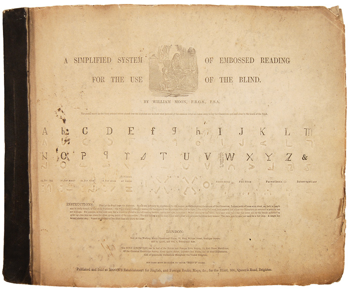


Recent Comments