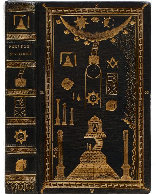
What end can be more noble than the pursuit of virtue? what motive more alluring, than the practice of justice? or what instruction more beneficial, than an accurate elucidation of symbols which tend to improve and embellish the mind? Every thing that strikes the eye, more immediately engages the attention, and imprints on the memory serious and solemn truths. Masons have therefore universally adopted the plan of inculcating the tenets of their order by typical figures and allegorical emblems, to prevent their mysteries from descending within the familiar reach of inattentive and unprepared novices, from whom they might not receive due veneration. – Illustrations of Masonry by William Preston (12th edition, 1812).
A very attractive recent acquisition is this Masonic binding on a copy of the twelfth edition of Illustrations of Masonry by William Preston, a philosophical statement and handbook of the secret society. The binding was executed in 1812, most likely by John Lovejoy who was himself a Mason and one of seven English binders regularly producing this style during the late eighteenth and early-nineteenth centuries. He can be identified by the tools he used; a similar binding in red morocco can be seen on the Bodleian Library’s website, and one also appears in the Maggs Brothers catalogue Bookbinding in the British Isles (though it was not unusual for binders to share tools, so we can’t be absolutely sure that Lovejoy produced this binding).
Click to enlarge:
Masonic binding by John Lovejoy.
The design on the upper board matches an engraving used in the book, on which Lovejoy must have based his tools:
What’s nice about these bindings is their lack of sophistication. There’s a charming naivety about the tools, as they reflect the styles of a previous era that had by this time filtered down to the middle classes (who were, of course, the primary followers of masonry). I’m particularly fond of the cherub that appears on the lower board:
First edition of Jane Austen’s Sense & Sensibility in the original boards (1811).
In spite of becoming a twentieth-century pop-culture phenomenon, the inspiration for numerous romantic films and chick-lit publications, Jane Austen remains one of literature’s most significant novelists. Today, in honour of International Women’s Day, we’ll push aside the accumulated sentiment to look at Jane Austen as writer and author, and examine the publishing history of her novels.
Austen was born in Hampshire, England in 1775, the seventh and youngest child of George and Cassandra Austen. George was an Oxford-educated rector, and the family was comfortably middle-class, closely-knit, and engaged with literature and culture. George saw to it that his daughters, Cassandra and Jane, were both educated, and Jane developed her taste for reading and theatricals from activities within the family, including the influence of her older brothers, as well as the libraries she had access to during several years at boarding school. Influenced by authors such as Henry Fielding, Jonathan Swift, and Samuel Richardson, she began writing stories and poetry at a young age, and many of her early pieces parodied the dramatic popular novels and histories of the era.
In the early 1790s Austen started composing full-length novels, beginning with Sense and Sensibility. It was not yet finished when, in 1796, she began work on “First Impressions”, the book that would become Pride and Prejudice. The first of her novels to be completed, this became a family favourite and was offered by her father to the publisher Thomas Cadell in 1797, but was turned down. Undaunted, Austen in 1798 and 99 completed her third novel, first titled “Susan”, and then “Catherine”, but renamed Northanger Abbey when it was later published posthumously. The rights to this third novel were sold to Richard Crosby & Son in 1803, though they failed to publish it.
Despite this setback, Austen and her family persisted in seeking publication, and they offered Sense and Sensibility to Thomas Egerton, who had previously printed James and Henry Austen’s Oxford periodical The Loiterer. As was common during the period, Austen was asked to pay for publication on a commission basis: Egerton fronted the money and the author was only paid after the printing costs and publisher’s commission were recouped. Henry Austen wrote that Jane was so concerned about the book not meeting the printing costs that she “made a reserve from her very moderate income to meet the expected loss” (Gilson p. 8). Austen, as she would be with each of her novels, was heavily involved in editing and preparing the text for publication, and wrote to her sister in spring of 1811 that, “No indeed, I am never too busy to think of S. & S. I can no more forget it, than a mother can forget her sucking child… I have had two sheets to correct, but the last only brings us to W.s. first appearance. Mrs. K. regrets in the most flattering manner that she must wait till May, but I have scarcely a hope of its being out in June” (Gilson p. 8).
Sense & Sensibility finally appeared in October 1811 as a three volume set in a print run of fewer than 1,000 copies, priced 15 shillings each. Despite Austen’s fears, it was a success, selling quickly and garnering positive reviews. The copy pictured above is a first edition in the original boards. This is a truly rare survival, as the board bindings produced by early nineteenth-century publishers were relatively flimsy and not originally intended to be permanent. Those who could afford it usually preferred to have the book bound in leather. Below, an example of the title page, with the anonymous attribution “By A Lady”:
Title page of the first edition of Sense & Sensibility.
The first edition was sold out by July 1813, and a second edition was published by Egerton in October of that year, with some corrections and changes, but also a number of textual errors, and it sold only slowly.
Austen’s second novel, Pride and Prejudice, was first published in January of 1813, also in three volumes by Egerton, in a print run that was likely 1500 copies.
Five copies were sent to the author, and on 29 January she wrote that “I have got my own darling child from London” (Gilson p. 24).
Below, an example of a first edition bound in contemporary tree calf, along with the title page. Pride and Prejudice was Austen’s bestselling book during her lifetime, and a second edition was published by Egerton in 1813 (it’s easy to tell the difference between the first and second editions because “second edition” is stated on the title page), as well as a third edition in 1817.
First edition of Jane Austen’s Pride & Prejudice (1813).
It is clear from her letters and other primary sources that Austen was serious about her writing and eager to be published. She established a routine for writing and was freed from much of the burden of housekeeping by her close female relatives. Austen also “dealt directly and firmly with her two publishers, Thomas Egerton and John Murray, complained when they were dilatory, and took a close interest in the progress of each of her publications, the costs of printing and paper (for which she was liable), and the copyrights and subsequent editions. She was not ashamed of meaning to make money” (ODNB).
Most tellingly, she carefully planned ahead for an additional three novels, ambitious narratives that would subvert the traditional storylines and sentiments to which her earlier books had adhered. Mansfield Park was begun in 1811 and finished in the summer of 1813, to be published in three volumes by Egerton in 1814. The print run was only 1,250 copies, with the publisher John Murray later expressing “astonishment that so small an edition of such a work should have been sent into the world” (Gilson p. 49). Pictured below is a copy in contemporary half calf with marbled boards:
First edition of Mansfield Park by Jane Austen (1814).
Title page to the first edition of Mansfield Park.
At this time Austen was becoming unhappy with the Egerton firm, feeling ignored and hoping for larger royalties and greater control over her work. Most importantly, she had been unable to make editorial changes to later editions of her previous novels, since the copyrights belonged to the publisher, who could do with the texts as he wished. So she approached another publisher, John Murray, who offered to print the second edition of Mansfield Park along with the first edition of her fourth novel, Emma. This is the only one of Jane Austen’s novels to bear a dedication, to the Prince Regent, the arrangement of which generated a richly comic correspondence between the author and the Prince Regent’s librarian. Both books appeared in 1816, and unfortunately competed with one another, reducing the number of copies sold and forcing Murray to remainder 539 of the 2,000 copies of Emma. Below, a first edition of Emma in contemporary black half calf with marbled boards:
First edition of Jane Austen’s Emma (1816).
Title page to the first edition of Emma.
Unfortunately, this disappointment was the culmination of Austen’s literary career. In 1816 she completed Persuasion, the third of her planned novels, but she also began having back pains, and by autumn was suffering severely from what was probably Addison’s disease. She soldiered on, and in January 1817 began a new novel, Sanditon, though very little had been written by March, when she became too ill to continue. Austen died aged 41 on the morning of 18 July 1817, with her closest companion, her sister Cassandra, at her bedside. Two more novels, the recently completed Persuasion and the older work Northanger Abbey (her brother had recently repurchased the copyright from Crosby), were published posthumously as a set in 1818. This was the first time that Austen was credited as the author of any of her books, and it also included a biographical note by her brother Henry, which was lavish (most have felt overly so) in its praise. The copy below is in a contemporary binding of half calf with marbled boards:
First edition of Northanger Abbey and Persuasion by Jane Austen (1818).
Title page to the first edition of Northanger Abbey and Persuasion.
Following this publication, Austen’s novels remained out of print for 12 years until the publisher Richard Bentley purchased the rights to all six books and in 1833 issued the first inexpensive editions, single volumes with an engraved frontispiece as illustration. His market was apparently the private buyer, as circulating libraries still had copies of the originals, and the lower cost allowed him to target the middle class. These early Bentley editions are more easily obtainable than true first editions of Austen’s books, and are very popular with collectors. Pictured below is the first Bentley edition of Mansfield Park in its original binding of purple calico with black labels to the spine. Like the first editions, Bentley’s editions were also available in more robust leather bindings, making these original, relatively fragile, cloth bindings uncommon.
First Richard Bentley edition of Mansfield Park by Jane Austen (1833).
Frontispiece to the first Bentley edition of Pride & Prejudice (1833). The Bentley editions were the first copies of any of Austen’s book to be illustrated.
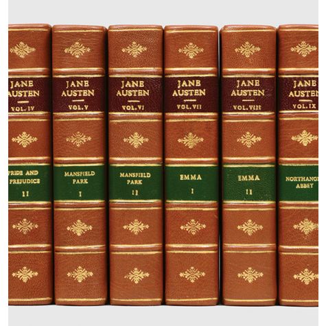
Despite the Bentley editions, Austen remained a marginal author through much of the nineteenth century. It was not until the publication of her nephew James Edward Austen-Leigh’s A Memoir of Jane Austen in 1869 that interest in her was renewed and the first serious literary analyses of her novels were published. In 1892 J. M. Dent published the first collected edition of her works to include critical commentary (pictured below is a set of the Dent editions illustrated by C. E. Brock). The first scholarly editions, edited by R. W. Chapman, were published in 1923. These became the standard for future study and placed Austen firmly within the canon.
The insistence from some quarters that Austen’s work is romantic escapism, light reading revolving around unimportant women’s interests such as dresses and balls, is far from the truth. Inspired by a wide-ranging English literary tradition that included non-fiction, serious novels, and dramatic fiction, Austen used her intellect and unique wit to subvert and parody contemporary literary styles. She experimented with a variety of subjects and formulas, constantly innovated, and creatively incorporated a range of earlier material into her own books.
Though she didn’t write directly about what some consider “serious subjects” such as war or politics, she engaged with important social issues from a female perspective, notably class distinctions, the gulf between manners and morality, religion and hypocrisy among the upper classes, and women’s dependence on men. And while she was later portrayed by her nephew as demure and hesitant to be published, she was in fact serious about her role as author, dealing with her male publishers firmly and directly, and involving herself in all aspects of the publishing process.
Her impact on the world of English letters has been justifiably significant, and her books continue to be as engaging, humorous, and thought-provoking as they were in her own time.
The J. M. Dent edition of the collected works of Jane Austen, the first edition illustrated by C. E. Brock (1907).
The standard bibliographies of Jane Austen are A Bibliography of Jane Austen by David Gilson (Oak Knoll Press, revised edition 1997) and Jane Austen:A Bibliography by Geoffrey Keynes (Nonesuch Press, 1929). Both are available from used booksellers on websites such as ABE.
Austen’s letters are available online. The text is that of the 1952 edition of the collected letters edited by R. W. Chapman, and is hosted by the University of Virginia Library.
There are only two conclusively identified portraits of Jane Austen taken from life, both by her sister Cassandra. The most famous is this pencil and watercolour sketch c. 1810, which is held by the National Portrait Gallery. (The other is of the back of her head, probably a joke on her sister’s part.)
The Bodleian recently acquired the last substantial Austen manuscript still in private hands, the unfinished novel The Watsons.
In this amusing clip from her recent documentary From Elegance to Decadance: The Age of the Regency, historian Lucy Worsley discusses Jane Austen, her relationship to politics, and the infamous visit to the Prince Regent’s palace.
The volume above, seen housed in its silk and velvet-lined case, represents the peak of twentieth-century book arts. Sangorski & Sutcliffe was founded in an attic in Bloomsbury in 1901 by two apprentice binders, and in only a few years it had become one of the most important binderies in the world. Francis Sangorski and his partner George Sutcliffe produced exquisite luxury bindings incorporating delicate inlays and onlays, detailed silver and gilt work, and valuable gemstones. The firm is perhaps best remembered for the book known as “The Great Omar“, a copy of The Rubáiyát of Omar Khayyám incorporating 150 individual jewels in its covers, which sank with the Titanic in 1912 only weeks before Sangorski himself died in a drowning accident.
This copy of A Dream of Fair Women (BOOK SOLD) by Alfred Tennyson was hand-written and illuminated on vellum and finely bound by Sangorski & Sutcliffe sometime between 1905 and 1911. The covers are blue-green morocco with brown and red onlays and exquisite gilt blocking, and feature five garnet and six turquoise cabochons inset into the upper cover. A very handsome example of the illuminations and jeweled bindings for which the firm was famous. As usual, click to enlarge the images.
Turquoise and garnet on the Sangorski & Sutcliffe binding.
Today’s post is a collaborative effort with my colleague Adam Douglas.
The philosophy of book dealing has changed radically since the days when dealers stripped every trace of prior ownership from books before reselling them, going so far as to wash medieval marginalia from the pages of manuscripts. Today, both dealers and collectors have a firmer grounding in the history of books and understand that vestiges of ownership not only give a book character, but can be valuable historical and cultural artefacts. Our practice at Peter Harrington is to preserve as much as possible about a book, including bookplates, ownership inscriptions and even the ephemeral items that we find nestled in the pages. But what do you do when those traces of the past are fraudulent?
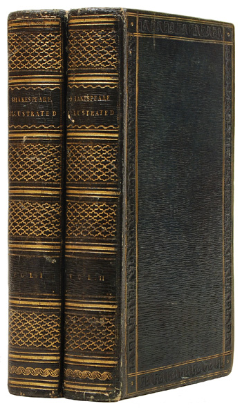
Last year a book runner dropped by the shop with a two-volume set of Shakespeare Illustrated, published in London in 1793 and bound in attractive Regency-era blue morocco.
The most interesting aspects of the set were its fore-edge paintings, miniature artworks painted onto the leading edge of the leaves that can only be seen when the pages are fanned. The runner claimed that these particular paintings were executed and signed by John Edwards of the Edwards of Halifax family, innovative booksellers and binders in London during the late 18th and early 19th centuries. John Edwards created some of the firm’s famous painted vellum bindings, and his fore-edge paintings are now highly sought-after. “Paintings signed by him are rare,” the runner reminded us.
The fore-edge of one volume as it normally appears. All that can be seen is the gold leaf covering the painting.
The fore-edge paintings on volumes I and II, visible when the leaves are fanned.
We bought the books but, as sometimes happens in large bookshops, they were set aside on the reserve shelves for over a year. When we looked at them again we were intrigued, but not in the way that we’d expected.
Our first indication that something was amiss was that the artist, who signed the paintings as “J. E.”, had also dated them to 1799. One of the reasons for the scarcity of fore-edge paintings signed by John Edwards is that he mysteriously disappeared during a business trip to Paris in 1793. His family came to the conclusion that he had run afoul of the revolutionary mob and been guillotined, but whatever the case, he was certainly not executing bindings in 1799.
Next we come to the book itself. Although done in Regency style, it doesn’t have any of the characteristics of a true Edwards of Halifax binding. It is not Etruscan calf or painted vellum, and the border decoration is not the Edwardses’ splendidly named “metope-and-pentaglyph” roll. The image below and to the left is a detail of the border decoration on our volumes, composed of alternating Greek key and leaf designs. To the right is a lovely metope-and-pentaglyph roll on a true Edwards of Halifax binding (many thanks to Phillip J. Pirages Fine Books for providing the photo). The metopes are the concentric circles and the pentaglyphs are the lozenges grouped in five.
On the front pastedown we found, reassuringly, the bookplate of the Earl of Rosebery (1847–1929), a prime minister and noted book collector unlikely to be fooled by a false fore-edge painting. Unfortunately, the plate only appears in the first volume, whereas Rosebery would normally have placed one in each volume. This example is also worn and scratched, as if it was removed from another book and pasted here to add authenticity.
By far the most spurious evidence is found at the front of each volume. Each is signed and dated 31 March 1849 by R. W. Hay. Tipped in opposite is a hand-written note, presumably by the person who sold Hay the books. “The fore-edges of the pages of these 2 volumes were painted by John Edwards, bookbinder of Halifax, brother of James Edwards, bookseller of London and were purchased by my brother James Frith at the dispersal of the Richard Heber Library in 1835 for £45. Alex Frith, The Close, Halstead, Essex, June 4th 1848.”
That seems clear enough at first glance. Richard Heber is probably the most famous book collector in English history: the term “bibliomaniac” was coined for him. He owned some 15,000 printed books, and his sales catalogues run to sixteen volumes. But £45 sounds like a lot of money in 1835, and we know from other reference sources that his copy of the second folio of Shakespeare made £10.5s. So according to the note, Alex Frith’s brother allegedly paid five times as much for these pleasant but ephemeral volumes as the second edition of Shakespeare’s plays made at the same sale. What Frith seems to have provided for the hapless Mr. Hay is the Victorian equivalent of an eBay certificate of authenticity.
So everything about the book speaks of a long history of fraudulent claims. Is it entirely worthless? We don’t think so. Described honestly, as an attractive book in an anonymous contemporary binding, we feel we can price it competitively. That leaves the question – should we remove the Rosebery bookplate and Alex Frith’s mendacious little note? To allow them to remain is to risk that future buyers will be duped, but removing them destroys the record of the deceit, which is interesting and even historically significant in its own way. What do you think? Let us know in the comments.


Recent Comments