Collecting Editioned Prints: Gustav Klimt

Collecting Editioned Prints: Gustav Klimt

Gustav Klimt, one of the most recognizable artists of the 20th century, scandalized the Viennese establishment and awed his contemporaries with his opulent and erotic nudes. He rose to fame as a leading member of the Vienna Secession, a movement closely related to Art Nouveau, and while his works include paintings of landscapes and gardens, he is best remembered for his sensuous depictions of the female form.

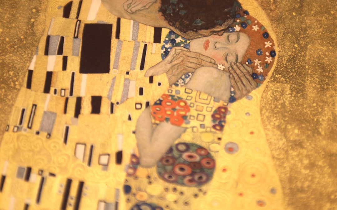
The Kiss (1907–08) is one of the world’s most iconic artworks and a masterpiece of fin-de-siècle painting. The intimate artwork, heavily embellished with gold leaf, silver, and platinum, was painted at the height of Klimt’s brief but majestic “Golden Period” (1901–09). Although KIimt’s output from these years represents only part of his oeuvre, the golden paintings from this time are his most well-known. They include Judith I (1901), The Three Ages of Woman (1905), and the lavish commission The Portrait of Adele Bloch-Bauer I (1903–07), which is so elaborately gilded that art critic Ludwig Hevesi hailed it as “a dream of bejewelled lust” 1. It made its model, a 26-year-old Viennese socialite, an instant celebrity.

Original artworks by Klimt fetch staggering prices. A subtler painting of the same model, The Portrait of Adele Bloch-Bauer II (1912), sold for $87.9 million in New York in 2006. In 2022, the landscape Birch Forest (1903) was auctioned for $104.6 million at Christie’s New York, setting a new record for Klimt. This record was broken the following year by the sale of Klimt’s final painting, Lady with Fan (1918), which was famously found on an easel in his studio at his death. The painting sold for $108.4 million at Sotheby’s, making it the most expensive public sale of any artwork in Europe.

While these soaring prices prevent all but the wealthiest collectors from acquiring original works by Klimt, his editioned prints offer an accessible foothold to the market. Limited edition prints are a coveted area for serious collectors, with prints by Edvard Munch, Pablo Picasso, Andy Warhol, and Banksy achieving seven-figure sales. The prices for individual prints from Klimt’s three editioned portfolios, Das Werk (1914), Fünfundzwanzig Handzeichnungen (1919), and Eine Nachlese (1931), sell for between £1,750 to £20,000 depending on variables such as condition, colouring, and the desirability of the original artwork.


Das Werk (1914)

Das Werk is the only editioned portfolio produced during Klimt’s lifetime. Overseen by Klimt in partnership with the Galerie Miethke, it was produced for the Kunstschau Wien 1908 exhibition, held to celebrate the 60th anniversary of the reign of Emperor Francis Joseph I. The portfolio was intended to advertise Klimt’s work to a wider audience and proved a success: Emperor Franz Joseph himself was a subscriber to the portfolio.

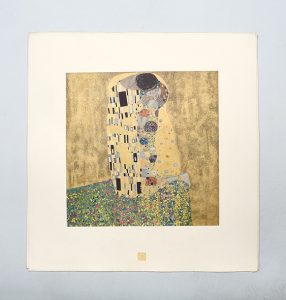
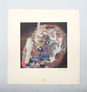
Comprising 50 unbound prints, the portfolio was issued to subscribers over the course of six years. Ten prints were released every 18 months, and each print was embellished by a unique gold signet designed by Klimt. The full portfolio comprises 40 monochromatic prints and 10 colour prints heightened with gold and silver: the latter are the most desirable, and include The Kiss, Judith, and several others from his Golden Period. Only 300 portfolios were produced and complete sets cost between £20,000 and £30,000. Many of the portfolios were broken up and individual prints circulate for sale individually.

Klimt died in 1918, shortly after the completion of Das Werk.


Fünfundzwanzig Handzeichnungen (1919)

The year after Klimt’s death, Vienna’s Max Jaffé issued the portfolio Fünfundzwanzig Handzeichnungen (“Twenty-five hand drawings”), comprised mainly of erotic sketches of nude women. It was posthumously published in an edition of 500, each portfolio containing 25 prints after line drawings by Klimt. There was also a Collector’s Edition of 10 portfolios numbered IX, each of which included an original drawing by Klimt.


Eine Nachlese / Dernière gerbe / An Aftermath (1931)

Eine Nachlese was published by Max Eisler, an art historian at Vienna University who had helped with the publication of Das Werk. The portfolio, published in a total edition of 500, comprised 30 prints, 15 of which were in colour. It was printed in three different languages: 200 copies in German, of which 30 were bound as a deluxe book; the French and English portfolios were printed in a run of 150 copies each, of which 20 were bound as a deluxe book.

Six of the paintings reproduced Eine Nachlese were lost, presumably destroyed, during the Second World War. They were in storage in the castle Schloss Immendorf in Austria when it was set on fire by a retreating division of the German army on 8 May 1945. They include two from Klimt’s Faculty Paintings, originally created for the ceiling of the Great Hall of the University of Vienna, Medizin and Jurisprudenz, and four from the famous Lederer collection: Die Freundinnen, Malcesine am Gardasee, Bauerngarten mit Hühnern, and Gastein.


Collotype Printing

All the prints in the three Klimt portfolios were produced using collotype printing – a delicate, laborious process, rarely used today. It is still considered one of the most faithful methods of reproduction, employed by artists including Max Ernst, Marcel Duchamp, and Gerhard Richter. In modern digital and offset prints, a photographic image is broken down into groups of tiny dots to give the impression of gradation, whereas in collotype printing, a photographic image is burnt into a thin layer of gelatin, which is then coated in ink and printed. The ink seeps into the gelatin, which allows for microscopically delicate reticulations, producing a more sincere reproduction of the image. Short runs are essential, as collotype plates are notoriously delicate and cannot be reused.

While collectors can still nurse the hope that a lost Klimt turns up in their attic (his Portrait of Fraulein Lieser was rediscovered in January of this year), the craftsmanship involved in the production of these prints, particularly those demanding multiple colours and metallic detailing, makes them very desirable for collectors who’ve yet to stumble upon an original work.

Written by Anna Middleton, Bookseller and Cataloguer

  1. Quoted in Philip Hook, Art of the Extreme 1905–1914, 2021.
Nigel Bents

Nigel Bents

From his own design work crafting “epic ephemera” to twenty years’ worth of memories at Peter Harrington, the head of our design team, Nigel Bents, has lots of stories to tell.

Nigel, you are one of the longstanding team members at Peter Harrington; how did you start working here?

I was asked to do a catalogue by Peter Harrington, Pom’s dad, twenty years ago – there were no pictures in it apart from the cover. After its completion, I began working as a freelance designer for the company; and a year later, I’d completed a grand total of five whole catalogues. The work fitted in nicely with my main job of running the first year BA graphics at Chelsea College of Art. Not having to worry about 80-odd students and simply moving type and book pictures around on a page in a quiet carpeted room at 100 Fulham Road became a sort of therapy, much like doing a sudoku. Through all this time, despite teaching term-time 4 days per week, senior specialist Adam Douglas has always maintained that teaching was simply my ‘hobby’ and that Peter Harrington catalogues were the real job.

How do you feel looking back at your earliest memories here?

This is probably answered best by my son George’s Father’s Day Card from long ago!! The catalogues took a long time to do in those far-off days; I thought they looked great at the time but now I can see clearly that they look utterly hideous. Like when that cool photo of you as a 17 year-old doesn’t look so cool a few years later.

How have things changed since you started working?

In those early days I would often spend all night formatting text, working 24-hour shifts. Pablo would get on his moped at Fulham Road and drop off a floppy disk/CD/Hard Drive down the road at college that Ruth, our photographer, had produced, so that I could get on with it after my teaching day was done. Those days and nights were long and hard. Nowadays, or course, it’s better. The software does so much more, and the cataloging team are each allocated specific aspects of preparation so that it runs pretty smoothly. We have an IT department too. In those far off days I would get Chelsea College’s IT department to fix problems!

Your funniest memory at Peter Harrington (if you can narrow it down to one!)?

I was working, at home, one night, finishing the Christmas catalogue – it’s the one catalogue that you can’t move the print deadline on. I was so tired that I left the laptop on the sofa, next to the dog, as I went up to bed at about 4:00 am. I came down a few hours later, all ready for the final push to discover that we’d been burgled – and they’d taken my laptop! I have no idea how we did send it to print, but the dog got a very hard time at her annual performance review. These days I’m re-assured by shop manager Joe Jameson’s adage that ‘there is no such thing as a rare book emergency’.

Who do you work with and how does the team work now?

It’s quite amazing that there are three of us designing now, and we’ve all been to Chelsea College! I share the print design workload with Abbie, who was a student of mine, and Sophie too, who works at Dover Street doing mostly on-line design with the marketing team. We all have different tastes so it’s great to see that reflected in design selections as we constantly try to refresh and broaden how we show our mostly antique imagery. Nowadays we have a wide range of specialists who each have their own take on how they’d like their collated material to appear. Working on these diverse collections – whether Poetry, Climate Change, Jazz, Occult – gives us a constantly varied range of visual matter and the opportunity to share their worlds and passions! Theodora flawlessly supervises our catalogue production – which has risen to a startling 18 scheduled this year in some form or other. It’s a pleasant experience in our small attic room at Fulham Road, and with many staff that have been here as long as I have, there are far less sleepless nights these days.

What are you passionate about?

I love letterpress and print, and recently completed ‘the Letterpress Manifesto’ – my love letter to print. And now that I have finished teaching, I’ve been delighted to continue to run some letterpress classes, taking Peter Harrington bookshop staff to the New North Press in Hoxton, where I formally took my students. After all, seeing as that’s how most of the books on our shelves were printed, everyone needs to know how it feels to hold type in their hands!

What design work do you do outside Peter Harrington?

I like to produce epic ephemera; meaningless flotsam and jetsam that I post to people. The American artist Ray Johnson with his ‘New York School of Correspondence’ started off what would later become known as mail art, which is how I can happily while away the hours if I’m not at the letterpress. Who needs to write a book when you can send a decent postcard?

You must come across so many items that catch your eye, are there any you would have liked to keep for yourself?

I used to collect stuff – postcards… trashy paperbacks… midcentury ceramics; but nowadays I’m more inclined to pass things on. It’s a worrying balance between being a collector and a hoarder; between being an obsessive and a health hazard.

How do you find inspiration?

Wandering around museums and galleries is always useful – I rather like PD James’s assertion that all you need for inspiration is time and a pile of junk.


How do you find inspiration?

Wandering around museums and galleries is always useful – I rather like PD James’s assertion that all you need for inspiration is time and a pile of junk.

Which designers do you admire?

I am a disciple of Abram Games with his ethos of ‘Maximum Meaning, Minimum Means’ – he was primarily a poster artist though; I’m not sure he did many book covers. That 1950s postwar period is a diverse mix of austerity and binge, of black & white and colour, of tradition and rock’n’roll. I often seek enlightenment from the creativity of that era. Ley Kenyon who illustrated the cover of People of the City, had forged documents as a captured airman in Stalag Luft III prison camp for the real ‘Great Escape.’ He subsequently taught the Duke of Edinburgh how to scuba dive in the pool at Buckingham Palace. And then taught at Chelsea Art School! Now there’s a CV to aspire to! Victor Reinganum’s cover image for the Prime of Miss Jean Brodie which we used on a Spring catalogue one year is a real joy too. Yep those Illustrated book covers from the 1930s-1960s are a glorious mix of lettering and image; I’ve included quite a few in my selection which is essentially a cross-section of what happens in my brain at any given moment.

Interview by Winifred Hewitt-Wright

Frieze Masters11th -15th October 2023

Frieze Masters
11th -15th October 2023

Location: The Regent’s Park, London

Website: www.frieze.com/fairs/frieze-masters

Peter Harrington will exhibit exceptional examples of printing, book design, binding, and illustration from across the world, spanning a millennium from the advent of printing in East Asia through to the 20th century. For over a thousand years, books and other works on paper have acted as a bellwether of continuously evolving artistic and aesthetic currents across the world. For this year’s Frieze Masters, Peter Harrington is delighted to exhibit books and prints that will allow visitors to explore the interactions across three continents between cultural taste, the fine arts, and the representation of the printed word and image.


Hours 
Wednesday, October 11, 11AM-7PM. Invitation only.
Thursday, October 12, Preview 11AM-1PM, General 1PM-7PM. From £145.
Friday, October 13. 11AM-7PM. From £75.
Saturday, October 14, 11AM-7PM. From £32.
Sunday, October 15, 11AM-6PM. From £32.
By its cover: E. McKnight Kauffer

By its cover: E. McKnight Kauffer

Colourful, carefully designed and highly produced; dust jackets are now ubiquitous in book publishing and are an important tool for publishers in making books look appealing to readers, communicating at a glance what they might find inside. However, it hasn’t always been so easy to judge a book by its cover.

The use of decorated dust-jackets only became common in the inter-war period, when artists began looking for a more commercial market for their work. Previously, a dust jacket was most usually a disposable, plain paper wrapper, intended only to protect bindings during transportation and display.

In the 1920s and ‘30s, publishers began to take advantage of dust jackets as tools to make their publications more attractive and as a space to include author biographies and adverts.

A selection of distinctive dustjackets from Victor Gollancz.

A selection of distinctive dust jackets from Victor Gollancz.

As many book collectors know, the presence of a dust jacket in good condition can increase the value of a book almost exponentially. Certain jackets, however, are collectable in their own right, and those designed by artist M. McKnight Kauffer between the 1920s and 1950s fall into this category. American by birth, Kauffer settled in Britain in 1914 and was known for producing iconic posters for the London Underground and Shell. His work was Modernist in flavour, and included Vorticist, Cubist and Futurist influences. His designs were popular with publishers who preferred abstract and symbolic, rather than figurative, designs for their covers. Kauffer’s talent for expression lay, said Aldous Huxley in his introduction to Kauffer’s Posters, in his methods of ‘simplification, distortion and transportation’. Kauffer’s style appealed particularly to publisher Victor Gollancz, who commissioned numerous jacket designs from him in a significant departure from their ‘house style’.  Researching the most eye-catching colours and designs by observing adverts in railway stations, Gollancz hit upon their signature design of bright yellow jackets with magenta and black text, and this style was continued for many years. Although more decorative, Kauffer’s semi-abstract designs chimed with Gollancz’s bold aesthetic and could be economically produced in two-colour print.

This collection includes almost forty books with jackets designed by Kauffer, designs for Gollancz, the Hogarth Press, as well as work for American publishers.

View all of our E. McKnight Kauffer items here.


If you would like to make an enquiry about selling a book or about the value of an item you own, please fill out the form which can be found here.

Peter Harrington Presents: Andy Warhol.

Peter Harrington Presents: Andy Warhol.

From September 1st, Peter Harrington will be exhibiting an extensive collection of rare, signed and limited edition prints, books and proofs by legendary pop artist Andy Warhol.


Andy Warhol  remains one of the best known artists of the 20th century. For the month of September, Peter Harrington’s Dover Street shop will be showing an assortment of limited edition & signed prints, as well as rare books and proofs. Available for viewing during shop opening hours (Monday-Saturday, 10am-6pm), the collection is notable in showcasing the sheer breadth of variety in the artist’s work.


Dover Street Window

Dover Street Window


Warhol began his career in the 1950s as a commercial illustrator, and the whimsical style he developed in those years is shown in some of his hand-finished, limited-edition publications, including 25 Cats Name Sam and One Blue Pussy (1954) and In the Bottom of My Garden (1956). These prints are particularly rare due to the bulk of his early work remaining in the pages of American magazines advertising commercial products. 

In the 1960s, Warhol applied his knowledge of American commercialism and the power of the brand to become a leader of the Pop Art movement, he and his Factory full of assistants endlessly replicating iconic images – the Campbell’s Soup cans and Marilyn Monroe being the most famous examples – using mechanical screen-printing techniques.

His compulsive reuse of these signature images in different contexts means that, while few of us can afford to compete with the likes of Hugh Grant for such works as Warhol’s 1963 screen print of Elizabeth Taylor – “Liz (Colored Liz)” sold at auction in 2007 for $23.7 million (£11.85 million) = the Gallery at Peter Harrington is able to offer many more affordable examples of Warhol’s well-known images, including a brown paper bag printed with Campbell’s Soup Can issued for the Warhol exhibition at the Boston Institute of Contemporary Art in 1996 (pictured above), as well as his later printed books.

Sam, Portrait, 1954

Sam. (Orange cat with yellow eyes, portrait.)


25 Cats Name Sam and One Blue Pussy, 1954.

The collection of plates we have on sale are editions of 190, all-offset lithographs on wove paper, handwash water colour.

Published early in Warhol’s career 25 Cats Name Sam and One Blue Pussy was self-published by Warhol as a private artist’s book. This series of ink wash cats number only 17, rather than the implied 25 of the title, though they are all named Sam, except the last, titled “One Blue Pussy”.

Warhol and his mother owned some 26 cats – again, all named Sam apart from one: Hester. While it’s not clear if the subject of the prints are the same cat, each one certainly has its own twist, predominantly shown through the use of the bright, psychedelic colouring that would define Warhol’s later work.

This production method – notable for Warhol having his friends colour the work at  ‘colouring parties’ – was to continue into his most famous period at ‘The Factory’, the artists New York studio in the 1960’s.


In the Bottom of My Garden.

Prints from the In the Bottom of My Garden series on display at Dover Street are offset lithographs on wove paper, hand-coloured by Warhol and friends with Dr. Martin’s aniline watercolour dye. Each image shows a playful wit in design, with the cherubs exuding a cutesy innocence and a sexual playfulness simultaneously. All are coloured in fluorescent pinks, oranges and greens.


Two Cherubs, 1956

In the Bottom of my Garden: Two Playful Cherubs. 1956


 Endangered Species

The Endangered Species portfolio was commissioned by activist-philanthropists Ronald and Frayda Feldman in the early 80’s and totals ten designs. Using his characteristic and celebrated bright colour schemes and block silhouettes, Warhol embraced the project and created these iconic images. All prints are presented in a white wooden frame with UV preventative perspex. All are signed editions of 150.

Bald Eagle: after a photograph by George Galicz. Screenprint on Lenox Museum board, San Francisco

Silverspot: after a photograph by Larry Orsak. Screenprint on Lenox Museum board,

Black Rhinoceros: after a photograph by Mohammed Amin. Copyright stamp in red to verso.


Black Rhinoceros by Mohammed Amin

Black Rhinoceros.


Cow

In 1966 Warhol exhibited Cow Wallpaper and Silver Clouds at the Leo Castelli Gallery. The Cows were Day-Glo colored, and the Clouds were floating silvery pillow shaped balloons. This iconic image by Warhol is one of his most sought after images. The image was reproduced in various official editions until the mid 1980’s.


Details of Renaissance Paintings. (Hors de Commerce)
This image, a screenprint on Cold Pressed paper is based on Paolo Uccello’s St George and the Dragon (1490) that resides on the National Gallery, London. The print is one of 4 Hors de Commerce impressions aside from the edition of 50. It shows the length of the dragon’s wing, and the head and shoulders of the female spectator from the left side of the original painting. Warhol has here replaced the depth and realism of the original with his trademark block colours and linework.
Signed and numbered in pencil lower left by Warhol. Stamped on the verso “Andy Warhol 1984, Editions Schellmann & Klüser, Munich/New York”. In excellent condition, it is presented in a silver frame with perspex.


Campbell’s Tomato Soup Can on Shopping Bag

Published for the Warhol exhibition at the Institude of Contemporary Art in Boston, this piece is from an unknown edition. A screenprint on a brown heavy paper shopping bag, the renowned Campbell’s Soup Can lives on in this seminal piece. It is presented here in a black wooden box frame.


Warhol's Soup Can on Shopping Bag, 1966.

Warhol’s Soup Can on Shopping Bag, 1966.


Flowers

We have three prints titled ‘Flowers’, each one of which is unique. Two of the prints, from the Peter M Brandt, Castelli Graphics and Multiples Inc., 1974 exhibition are hand coloured with Dr Martin’s aniline watercolour dye on Arches or J. Green paper. Presented individually float mounted in a black laquer frame under UV glass, both are signed and dated by the artist.
The third is a decade earlier, published to coincide with Warhol’s exhibition at the Leo Castelli Gallery in 1964, and is an offset lithograpgh signed and dated by the artist. It is presented at Peter Harrington in a white gold leaf frame.


Lincoln Center Ticket

Published to commemorate the Fifth New York Film Festival, held at the Lincoln Center in New York. Presented here in the original metal frame supplied by Amos Vogel when he received the print in 1968, Warhol’s signature can be seen in the window to the back of the frame.
From the estate of Amos Vogel, champion of independent and international cinema (co-founder of the New York Film Festival, the groundbreaking society Cinema 16, and author of Film As a Subversive Art), the piece was gifted to him at the annual festival by Warhol himself.


Original proofs for the artwork on Love You Live.

Original proofs for the artwork on Love You Live.


The Rolling Stones

Possibly unique proofs for the artwork on the Love You Live, commissioned from Warhol for the album. It is almost certain that these two colour-printed proofs, purchased from the late Art Collins, President of Rolling Stones Records, are the only surviving set showing the design as intended by Warhol. The hand drawn title and track listing issued on the printed album were strongly opposed by Warhol, who later wrote “I told Jerry I thought Mick had ruined the Love You Live cover I did for them by writing all over it – it’s his handwriting, and he wrote so big. The kids who buy the album would have had a good piece of art if he hadn’t spoiled it” (The Andy Warhol Diaries, 5 July 1978). Warhol was thus loth to sign copies of the album, unusual for a man so notorious for signing more or less anything put in front of him.


Reigning Queens Portfolio

Queen Ntombi Twala of Swaziland, signed and dated by Warhol in 1985, is one of four images created of the only four female reigning monarchs in the world at that time. The other portraits include Queen Beatrix of the Netherlands, Queen Elizabeth II of the United Kingdom and Queen Margrethe II of Denmark. Based on official or media-sourced photographs, Warhol has incorporated blocks of colour that, although screen printed, appear collaged. He has also combined printed elements derived from drawings, which emphasise details such as jewellery