
Bookplates
“Familiar signs of ownership”
So, what is a bookplate? Book historian David Pearson explains: “the use of engraved or printed paper labels, carrying an owner’s identity, to mark the possession or gift of a book, is almost as old as printing itself, and it is one of the most familiar signs of ownership seen by students of provenance”.

Chronology of Styles
One of our earlier examples is that of the quarrelsome bishop of Bangor, John Evans (c.1652-1724), who was foolish enough to pick a fight with Jonathan Swift. His handsomely curlicued plate, a fine example of what is known as the Early Armorial style, appears in a special copy of the Earl of Clarendon’s Survey (1676), a fierce critique of Thomas Hobbes’s Leviathan. The plate displays the symbols of his office (the mitre, crozier, and key) and bears a very close resemblance to that of another bishop, Henry Compton of London. This is illustrated in David Pearson’s Provenance Research in Book History, where he identifies the engraver of Compton’s plate as William Jackson, “who actively solicited clients for bookplates and who thereby became a major influence in popularising their usage”.

The next fashion to emerge in Britain is the rather confusingly named Jacobean style, introduced a little before 1700 and popular until around 1745. A nice example of this is that of Henry Home, Lord Kames (1695-1782), whose plate appears in a collection of works by the Scottish philosopher Andrew Fletcher of Saltoun. Here we have vigorously scrolled mantling surrounding his coat of arms, below which is placed a scallop-shell, a common feature of such plates.


Next is Chippendale, the style that succeeded the Jacobean, named after the famous cabinet-maker, and fashionable between roughly 1740 and 1780. This example belonged to Sir Edward Winnington (1749-1805), of Stanford Court, Worcestershire; a pretty plate, alive with rococo flourishes and a hint of chinoiserie (very much en vogue) and is pasted into his handsomely bound Cambridge-printed Bible of 1768.
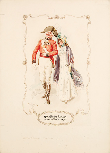
Now we come to a personal favourite, the eye-catching military bookplate of Charles William Vane, third marquess of Londonderry (1778–1854): pendant to his arms are his many military awards, and for good measure there are supporters in the shape of prancing hussars; at the top there are two crests flanking his coronet and below a flowing banderole bearing his motto. A brave but not particularly brilliant soldier – Sir John Moore described him as “a very silly fellow” – Vane served with variable distinction throughout the Peninsular War. The plate reveals something of the character of the man, whose dashing and dandified portrait by Sir Thomas Lawrence is at the National Portrait Gallery. “Silly” he may have been, but Vane was a discerning collector; his plate appears here in The Antient and Present State of the County of Down (Dublin, 1744) by the Irish antiquary Charles Smith.

Now we come to a personal favourite, the eye-catching military bookplate of Charles William Vane, third marquess of Londonderry (1778–1854): pendant to his arms are his many military awards, and for good measure there are supporters in the shape of prancing hussars; at the top there are two crests flanking his coronet and below a flowing banderole bearing his motto. A brave but not particularly brilliant soldier – Sir John Moore described him as “a very silly fellow” – Vane served with variable distinction throughout the Peninsular War. The plate reveals something of the character of the man, whose dashing and dandified portrait by Sir Thomas Lawrence is at the National Portrait Gallery. “Silly” he may have been, but Vane was a discerning collector; his plate appears here in The Antient and Present State of the County of Down (Dublin, 1744) by the Irish antiquary Charles Smith.

Women Collectors
A trio of women collectors can here stand-in their sister-bibliophiles. Preeminent among them is Frances Mary Richardson Currer (1785-1861). Her simple but unusually shaped armorial plate can be seen in a lovely copy of a fine edition of the works of Caesar (1790), a testimony to her taste and discernment.
A rather delightful plate (designed by one L. Bradshaw) enlivens the front pastedown of Dorothy Bussy’s novel Olivia (1948). This belongs to Muriel Orr-Ewing (1900-1994), who, after years of travel and three marriages, in 1940 set up a finishing school in London called The Grove. She was a founding president of the British Association of Women Executives and dabbled in filmmaking.

A rather delightful plate (designed by one L. Bradshaw) enlivens the front pastedown of Dorothy Bussy’s novel Olivia (1948). This belongs to Muriel Orr-Ewing (1900-1994), who, after years of travel and three marriages, in 1940 set up a finishing school in London called The Grove. She was a founding president of the British Association of Women Executives and dabbled in filmmaking.

In her first edition of Frank Baker’s Miss Hargreaves (1940), Kathleen Joan Dawson has pencilled in the space at the foot of her Walter Crane-inspired bookplate that it was “a gift from the author”. Hopefully his comic fantasy lightened the war years, and she would surely be cheered to know that the book has been carefully looked after and remains in very good condition.
In her first edition of Frank Baker’s Miss Hargreaves (1940), Kathleen Joan Dawson has pencilled in the space at the foot of her Walter Crane-inspired bookplate that it was “a gift from the author”. Hopefully his comic fantasy lightened the war years, and she would surely be cheered to know that the book has been carefully looked after and remains in very good condition.
Stepping into the limelight among celebrity bookplates is that of Noël Coward, an unsurprisingly elegant affair that combines the masks of comedy and tragedy into a single persona. It adorns a first edition of Thunderball (1961), jokingly inscribed to “The Master” by Ian Fleming.


Open this first edition of Alice Through the Looking-Glass (1872) and you are confronted by an alarming memento mori in the form of a skull through which a worm wriggles. The owner’s initials “PMF” are tattooed on the forehead. Despite our best endeavours, he or she remains elusive.
Open this first edition of Alice Through the Looking-Glass (1872) and you are confronted by an alarming memento mori in the form of a skull through which a worm wriggles. The owner’s initials “PMF” are tattooed on the forehead. Despite our best endeavours, he or she remains elusive.

Multiple Ownership and Upstaging
Sometimes bookplates show us ownership by more than one person. A copy of the signed limited edition of Jean Genet’s The Balcony (1958) bears the bookplates of two eminent collectors: Robert A. Wilson, proprietor of the famous Phoenix Bookshop in Greenwich Village, and Donald G. Drapkin, whose collection was sold through Christie’s in 2005.

Here owners share equal billing on the front pastedown. However, sometimes one owner may upstage another. A nice exemplar turns up in a first edition of Tess of the d’Urbervilles (1891): occupying the front free endpaper is the unremarkable armorial bookplate of American collector E. Hubert Litchfield. Facing him is William Henry Radcliffe Saunders, army officer and member of the Bookplate Society, who in 1904 commissioned a zinger of a bookplate from the distinguished Scottish engraver-designer Graham Johnston. Here the dense foliate mantling embraces his coat of arms and crest, a wonderful betusked elephant head. By comparison, poor Litchfield looks rather timid.


Melancholic Remains
And then there are those books from which the bookplate has been torn, roughly erased, or simply annihilated, leaving but a ghost; as if the current owner could not bear the presence of a predecessor. But sometimes enough of a trace is left to give a clue: luckily Victor Duchâtaux (1823-1905), a lawyer and member of the municipal council at Reims, is unaware of the fate that befell his bookplate, the heart of which has been wrenched out. The book in which it clings on, a first edition of Jean Bodin’s De la demonomania des sorciers (Paris, 1580), the most influential witch-hunting guide of the sixteenth-century and a Renaissance best-seller, must have once taken pride of place in his library. He is almost gone but not quite forgotten.
")


Recent Comments