Collect what you love – the best book collections reflect the personalities and interests of their owners. With effort and a little luck the hobby can be financially rewarding, but like all investments it’s never a sure bet. Those who reap the greatest rewards are usually those who buy the books they love.
Our books will in all likelihood outlast us, so it’s many collectors’ philosophy that they are paying not for the book itself, but the privilege of preserving it for the next generation.
Condition is one of the most important considerations in book collecting, so buy at the best condition possible within your budget. It’s generally better to have a small collection of superior quality books than a large collection of lower quality. Also make sure that you have a safe place to store your books – they should be kept out of direct sunlight, away from radiators and moisture, and not exposed to swings in temperature.
Pick a specific collecting area. Starting with something as general as “photography books” can be overwhelming. Instead, narrow it down to “photographs of the American West” or “late 20th-century fashion photography”. You can always expand from this as you develop your collection, or stop and start over with an entirely different topic.
Don’t be afraid to be original. It’s exciting to collect in a niche subject area, and you’ll have less competition for material. It can also make your collection more appealing when the time comes to sell or donate.
Look at books. The internet has made it easy to collect from home, but you should still spend as much time as possible viewing books in person. Become a regular at local rare book shops, which can be discovered via the Antiquarian Bookseller’s Association (Britain), the Antiquarian Booksellers Association of America, and the International League of Antiquarian Booksellers. These organisations also maintain lists of upcoming bookfairs, which are a wonderful way to see books and to make connections with dealers from around the world.
Be extremely cautious about purchasing books from online auction sites, as it can be difficult to return them if there is a mistake in the description. Dealers who are members of the organisations listed above abide by strict professional standards regarding descriptions and return policies.
Familiarise yourself with the reference material in your subject area, particularly the bibliographies, which describe important editions of books and often provide information on their publishing history, scarcity, and historical or literary importance. The Oak Knoll shop in Delaware is a particularly good source for books about books.
Sign up for dealer newsletters, online catalogues, and updates for books matching your interests (click here to sign up for our catalogues). Most of the large auction houses also provide these types of services. Reading catalogues, even if you’re not planning on buying from them, is a great way to educate yourself about the market.
If you’ve been collecting for a little while and find that you really enjoy the hobby, consider taking a course at one of the rare books schools located in Virginia, California and London.
The first two decades of the 20th century have become known as the Golden Age of Illustration, when improvements in printing technology allowed publishers to produce lavish colour illustrations for the first time. Of all the artists who became famous in this period, by far the most popular was Arthur Rackham, who still maintains his hold over the public imagination a century later.
Arthur Rackham was born in London in 1867 and as a child showed great talent for drawing. After finishing his early education at the City of London School he began working for an insurance agency while attending Lambeth College of Art. He later described this period to a young admirer:
….for the next seven years or so I worked as hard as I could out of business hours (9–5) to equip myself as an artist – not being able to embark on a professional career till I was nearly 25, & then for many years getting the barest living from my profession & having to do much distasteful hack work.
What Rackham described was working as a jobbing illustrator for popular newspapers, his main means of support during the 1880s and early 1890s. He was also commissioned to produce illustrations for a number of books, beginning with an 1893 travel book called To The Other Side, a particularly rare volume of which only a handful of copies are known today.
Arthur Rackham illustration from To the Other Side.
In the late 1890s Rackham produced his first illustrations of a piece with his later, well-known works: The Ingoldsby Legends in 1898, Tales from Shakespeare in 1899, and Tales of the Brothers Grimm in 1900. Though the illustrations in these volumes were not as accomplished as Rackham’s later work, all would be reissued with reworked drawings after he became famous.
Arthur Rackham’s Fairy Tales of the Brothers Grimm, 1909 edition with reworked illustrations.
The turning point for Rackham came in 1900, when he met his future wife, Edyth Starkie, who was living in the house next door to his Hampstead studio. Starkie was also an artist and was developing a considerable reputation as a portrait painter. “His alliance with this gay artistic Irishwoman brought out the best in Rackham; for she was always his most stimulating, severest critic, and he had the greatest respect for her opinion”.
Most critics agree that it was during Rackham’s courtship and early marriage that he matured fully as an artist. Previously he had focused on line drawings, but from his wife he learned to use colour, particularly watercolour, much more effectively. This talent was developed at a propitious time, as technological advances dramatically improved the quality of book illustrations, allowing his art to achieve its fullest expression.
Unlike previous illustrators, who relied on an engraver to cut clean lines on a wood or metal plate used for printing, Rackham could have his pictures photographed and mechanically reproduced. This change removed the middleman between Rackham and his finished product. In particular, it allowed Rackham to display his particular gift for line, which an engraver, lacking Rackham’s talent, likely could not render onto a printing plate. (Central Michigan University Library)
This type of printing required glazed paper that had to be pasted in (“tipped-in”) after the text was printed. Although this made publications more expensive, “the result enhanced the appearance of books and helped create the early-twentieth-century market for gift-books”.
These new skills and techniques are on display in Rackham’s first major success, Rip Van Winkle, the book that would establish him as “the leading decorative illustrator of the Edwardian period”.
Deluxe first edition of Arthur Rackham’s Rip Van Winkle, published in 1905.
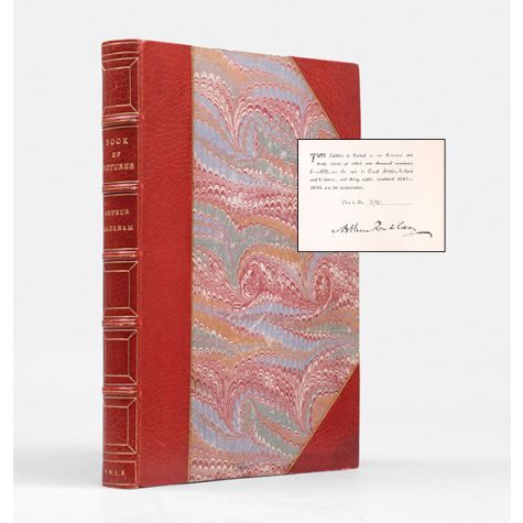
It was also the beginning of a successful partnership with the publisher William Heinnemann. The lucrative pattern that they established was to sell a small number of signed and finely bound copies, like the one above, as well as a larger number of trade editions bound in cloth, capturing multiple segments of the market at once. Legendary London bookbinders Sangorski & Sutcliffe bound many of the deluxe copies of Rackham’s books, often as presentation copies for the artist to give away. Rackham even designed the gilt tools used for the bindings:
Rackham gilt tool from the cover of a copy of Peter Pan in Kensington Gardens bound by Sangorski & Sutcliffe.
Another precedent established with Rip Van Winkle was for Rackham to promote each book by exhibiting his original paintings at the Leicester Galleries in London. In this way he helped to promote the book (the entire deluxe edition was subscribed by the time the exhibition closed) and also earned extra income selling the original artwork. This tactic was incredibly successful and helped make him one of the most highly paid illustrators of the era, earning an astonishing £7,000 in 1920, in large part from the sale of his paintings.
Arthur Rackham’s Rip Van Winkle.
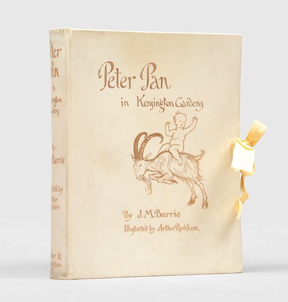
The Rip Van Winkle exhibition had a further advantageous consequence: it brought Rackham the commission for the first edition of Peter Pan in Kensington Gardens.
In 1905 J. M. Barrie visited the Rip Van Winkle exhibition and was so taken with Rackham’s artwork that a meeting was arranged to discuss collaboration on a Peter Pan book. The “boy who never grew up” had first appeared as one of many stories in The Little White Bird (1902), and became a successful theatrical production the following year. But it was the partnership between Rackham and Barrie that made Peter Pan in Kensington Gardens the “outstanding Christmas gift-book of 1906″, and one of the most beloved of all 20th-century children’s books. It was also one of Rackham’s biggest financial successes, reprinted numerous times and leading to the production of the Peter Pan Portfolio, a selection of twelve of the artist’s favourite illustrations reproduced in their original sizes.
Peter Pan in Kensington Gardens (From “The Little White Bird”), 1906. Signed limited edition, number 267 of 500 copies signed by the artist.
For the next ten years Rackham was the preeminent illustrator in Britain, so fully booked with commissions that he often had to turn offers down. The one he most regretted was Kenneth Grahame’s invitation to illustrate the first edition of The Wind in the Willows, which he declined in order to complete what is probably his greatest work: A Midsummer Night’s Dream. Published in 1908, it was described by the designer William de Morgan as, “the most splendid illustrated work of the century”, and Rackham’s biographer has argued that his “gnarled trees and droves of fairies, have represented the visual reality of the Dream for thousands of readers. Here he excelled especially in landscape, and in reconciling dream and reality, giving himself to the luxury of rich detail with a rare generosity”.
Arthur Rackham illustration for A Midsummer Night’s Dream.
Another significant work from this period was Alice in Wonderland. In 1907 the original copyright expired and a number of publishing firms planned new editions, with Rackham’s version gaining much attention, though not all of it positive. Many readers loved the new illustrations, but Alice was “so completely identified with the drawings of John Tenniel that it seemed to many critics almost blasphemous for anyone to attempt to prepare alternatives”. Nevertheless, the book was successful, and Rackham’s lively designs, still in print, place his Alice among the best loved of all versions of this classic.
Arthur Rackham, Alice in Wonderland.
During the 1920s Rackham’s reputation expanded overseas. Though the privations of the First World War had dampened British enthusiasm for deluxe illustrated books, a new generation of collectors was establishing itself in the United States. Rackham illustrated a variety of books conceived for the American market, including Where the Blue Begins by Christopher Morley (1925), Washingon Irving’s The Legend of Sleepy Hollow (1928), and Edgar Allan Poe’s Tales of Mystery and Imagination (1935).
Arthur Rackham’s illustration of Ichabod Crane for The Legend of Sleepy Hollow (1928).
Rackham’s career continued to be productive during the 1930s, his last decade of life. Though the family struggled with his wife’s ill-health, he also experienced the joy of his daughter’s marriage in 1935, and in the same year held his first exhibition at the Leicester Galleries since 1919. Commissions continued to roll in, and in 1936 a representative of the Limited Editions Club paid a call. Discussing the possibility of the artist illustrating some books for them, he idly suggested The Wind in the Willows. To his surprise he saw Rackam “much moved”.
‘Immediately a wave of emotion crossed his face; he gulped, started to say something, turned his back on me and went to the door for a few minutes.’ When he came back he explained that for years he had ardently wished to illustrate the book, and had always regretted that he had refused the invitation of Kenneth Grahame and his publishers nearly thirty years before.
After Rackham had declined the Wind in the Willows commission to work on A Midsummer Night’s Dream, the book was published without illustrations and remained so until 1931, when Ernest H. Shepherd completed his own version. It was one of the great regrets of Rackham’s life, but now, even as his health was failing, he had another chance.
Slowly, the drawings for The Wind in the Willows neared completion. The last drawing of all to be finished was that of Rat and Mole loading their boat for the picnic. Rackham’s daughter remembers his great exhaustion and the extreme difficulty he had in getting it done. When he had, as he thought, finished it, he suddenly discovered that there were no oars in the boat. Barbara tried to persuade him that this was a detail that did not matter, but he insisted that everything must be right, and with great labour he altered the drawing and put in the oars. After he had done this, he lay back in bed and said: ‘Thank goodness, that is the last one.’ And so it proved in every sense.
Arthur Rackham’s final drawing, for The Wind in the Willows.
One of the most common misconceptions about books is that misprints and typos make them rare or valuable. Unfortunately, while certain types of errors can contribute to a book’s collectability, these alone will not increase the value of an otherwise inexpensive misprinted books. Consider the following case:
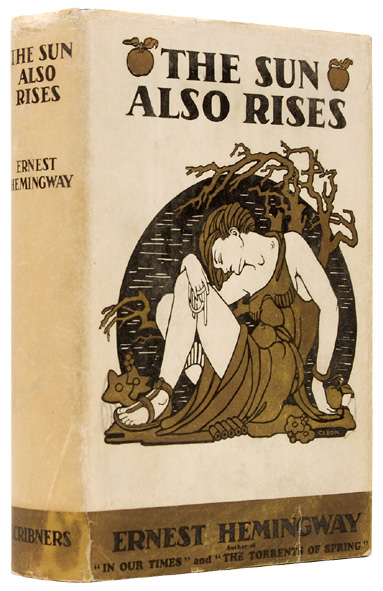
The Sun Also Rises is one of the most important novels of the twentieth century. Widely considered to be Ernest Hemingway’s best book, it is also the founding text of the “Lost Generation” of writers who came of age during the First World War. This significance, combined with the small number of first editions available today (5,090 copies were printed and few have survived in collectible condition) is what makes it valuable.
First edition of The Sun Also Rises by Ernest Hemingway (1926). BOOK SOLD
So where do misprints and typos come in? In this case, an error on page 181 (“stoppped” instead of “stopped”) appears in only the earliest issue of the book and was quickly corrected by the printer. When accompanied by other signs, such as the correct date, publisher, and binding, it means that these misprinted books were one of the very first to be printed, making it more desirable to collectors.
On the other hand, any inexpensive reprint of the same book might contain a misprint. But if the edition is not particularly interesting or uncommon, and the order in which the book was published is not important, then the misprint is just a nuisance. It isn’t the typo alone that makes a book valuable, it’s what the typo indicates: how early a specific copy was published and how rare it is.
For a small number of very important books such as The Sun Also Rises, misprints can have an impact on value, but in most cases they don’t make a difference. To find out more about first editions, see our posts:
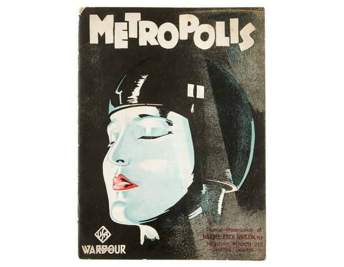
Original Metropolis film programme for the British premiere of Fritz Lang’s film in 1927.
The world’s most valuable movie poster, for Fritz Lang’s 1927 masterpiece Metropolis, is to be auctioned again after making a record $690,000 in 2005. Ephemera related to the film is notoriously scarce, with only four copies of the poster known to survive.
Almost as uncommon is this amazing Metropolis film programme produced for the London premiere at the Marble Arch Pavilion on March 21, 1927, one of only three copies that we have handled.
Not only a list of cast and crew, it includes eleven short pieces on the making of the movie, commentary from the director and cast, and numerous production photographs and film stills, many attractively arranged as modernist collages.
One of the most interesting sections shows in parallel columns how a passage of film scenes was adapted from the novel of the same name by Lang’s wife, Thea von Harbou.
Below the fold you’ll find the complete booklet – just click any image for the high-res version:
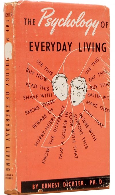
First edition of The Psychology of Everyday Living by Ernest Dichter (1947).
Mid twentieth-century America. In a corporate board room, hazy with tobacco smoke and whiskey fumes, a man pitches innovative new advertising ideas.
Soap isn’t just for mundane hygiene issues, it’s associated with sensuality and should be marketed as sexy and refreshing.
Cigarettes aren’t just commodities, they’re rewards for a job well done, or a break from a stressful work day.
Car makers should promote their brands with convertibles because men associate them with freedom and the fantasy of having a mistress, even if they end up buying a sedan when they take their wife back to the dealership.
Mad Men’s Don Draper.
Don Draper, right? Now in its fifth season, Mad Men has reintroduced the American public to the advertising revolution that led companies away from spots extolling their product’s obvious uses to a new style targeting consumers’ unspoken desires. But the instigator of this movement was not a mysterious and dangerously sexy ad executive like Don Draper. He was a much more interesting figure who forever changed American consumerism.
Ernest Dichter (1907–91).
Ernest Dichter was born in Vienna in 1907 and following a severely impoverished childhood was employed in his uncle’s department store. Working as a window dresser, he became interested in marketing and introduced new American ideas into the shop, such as the use of music to soothe customers.
In 1938, following university training in psychology and informal training in psychoanalysis, he moved to New York with his wife and only $100 to his name. Dichter worked for a time with a traditional market-research firm, but in 1939 he sent a letter to six corporations in which he offered his understanding of psychoanalysis as a way to radically improve their marketing strategies. Four responded, and his first contract was for Ivory Soap. Using in-depth consumer interviews, he learned that when shoppers picked a particular brand,
“it wasn’t exactly the smell or price or look or feel of the soap, but all that and something else besides—that is, the gestalt or ‘personality’ of the soap.
This was a big idea. Dichter understood that every product has an image, even a ‘soul’, and is bought not merely for the purpose it serves but for the values it seems to embody. Our possessions are extensions of our own personalities, which serve as a ‘kind of mirror which reflects our own image’. Dichter’s message to advertisers was: figure out the personality of a product, and you will understand how to market it” (The Economist).
Dichter’s belief in good marketing went beyond creating successful ads; it became a total philosophy. Profoundly affected by the turmoil he had experienced as a young man in Europe, he believed that consumerism was the only bulwark against totalitarianism. The public, he argued, must learn to stop feeling guilty. They must accept and fulfill their unconscious desires, or risk falling under the spell of communism or fascism.
In light of this, he wrote his first book for the general public. The Psychology of Everyday Living (BOOK SOLD), published in 1947, was
“designed as an accessible self-help manual to help Americans ‘accept the morality of the good life’… As America entered the 1950s, the decade of heightened commodity fetishism, Dichter offered consumers moral permission to embrace sex and consumption, and forged a philosophy of corporate hedonism, which he thought would make people immune to dangerous totalitarian ideas” (Cabinet Magazine, issue 44, p. 30).
Chapters such as “The Magic of Soap”, “What Bread Means to You”, “How to Be Happy While Cooking”, and “The Psychology of Buying” purported to solve the problems of everyday life, but largely encouraged a positive attitude to consumption by stressing the good feelings associated with a new purchase or the use of a specific commodity.
The book is extensively illustrated, with images that promote consumerism even more blatantly than the text does. A photograph of a woman applying makeup is captioned “Cosmetics provide psychological therapy”, and another of a man trying on a hat reads, “The right kind of hat gives us dignity”.
In chapter after chapter, Dichter posits that consumer products can help us express our individuality, engage with the world in new ways, or simply provide a self-esteem boost:
The chapter on cigarettes argues that those who try to abstain from smoking are wrong to feel guilty about the habit. Dichter writes that,
“Efforts to reduce the amount of smoking signify a willingness to sacrifice pleasure in order to assuage their feeling of guilt… Guilt feelings may cause harmful physical effects not at all caused by the cigarettes used, which may be extremely mild. Such guilt feelings alone may be the real cause of the injurious consequences”.
One of the photographs used in this chapter has a decidedly sexual subtext:
Automobiles, according to Dichter, aren’t simply for running errands or getting to work. They’re about freedom, personal identity, youthful self-assertion, and, of course, sex.
Probably the best illustration is “What is bought depends on what the woman says”:
Though Dichter faced scrutiny from those who were wary of the corporate hold on Americans’ psyches, criticism only seemed to generate more converts. But his method did have faults, and executives in the early 60s began to feel that his ideas were sometimes too strange to be practical. Like Don Draper dismissing the psychoanalyst in the first episode of Mad Men, the director of a Pepsi campaign fired Dichter when he was told that ice shouldn’t be used in advertisements because it reminded consumers of death. At the the same time, the advent of accessible computing meant that firms were able to return to more scientific methods of researching consumer behaviour. But Dichter remains the most important figure of twentieth-century advertising. Glance at the television or pass a billboard and you’ll recognise that the concepts he pioneered still dominate the advertising that surrounds us.
Duke University’s John W. Hartmann Center for Sales, Advertising, and Marketing History has digitised a huge range of twentieth-century advertising, including both print ads and television commercials. In many cases you can see the difference between pre and post-Dichter advertising strategies.


")


Recent Comments