One of the most visually delightful items to land on my desk recently, is a set of Arts & Crafts magazine is a wonderful record of the Arts & Crafts and Art Nouveau movements and their appeal to amateur artists and craftspeople.
The Arts & Crafts Movement grew from the ideals of William Morris and John Ruskin, who believed that modern industry was detrimental to English life and aesthetics, dehumanizing the production of goods and influencing the Victorian taste for inexpensive yet gaudy decor. Beginning in the 1860s Morris, Ruskin, and their followers advocated the return to skilled craftsmanship and an over-arching aesthetic influenced by traditional styles such as the Gothic. Morris’s interior design firm became famous for its wallpapers, textiles and stained glass, and his Kelmscott Press revived the art of the hand-press by creating masterpieces of book design such as The Works of Geoffrey Chaucer.
Appearing in the 1890s, and in many ways inspired by Morris, Art Nouveau did not have a social reform aspect like that of the Arts & Crafts Movement, but it did advocate a total aesthetic incorporating art, architecture, and interior design. Its proponents were inspired by graceful and curving natural forms, such as the flowing shapes of plants and the iridescent bodies of insects. The two styles were contemporary for a short period, and the Art Nouveau aesthetic meshed well with the Arts & Crafts emphasis on romanticism and hand-production.
Wrapper to the first number, bound in to volume I.
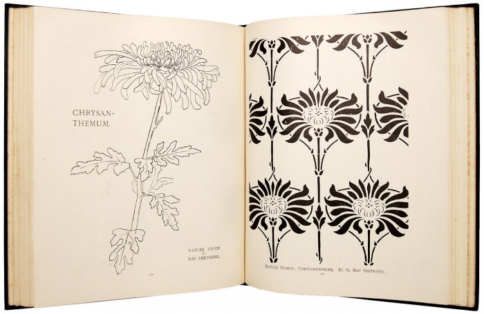
Both movements were also popular with the middle and upper classes, who took to them as hobbyists and semi-professionals (with book binding becoming a particular favourite of artistically-minded women), not unlike the contemporary resurgence of crafting as exemplified by Etsy. It was to capitalize on this trend that Arts & Crafts magazine was founded in 1904. It described itself as “A Monthly Practical Magazine for the Studio, the Workshop, and the Home”, but based on the contents its primary audience was not composed of professionals but middle and upper class people with free time, disposable incomes, and an interest in art but no formal training. It featured practical articles on supplies and tools, instructions for reproducing professional techniques, stylistic advice and patterns, photographs of professional work and museum pieces, announcements of amateur competitions, and general art and exhibition news.
Our set includes all the issues up to April 1906 (the British Library holds issues dated up to August of that year), bound together in four volumes and retaining the original wrappers from some of the issues. It is replete with large photo spreads and detailed instructional diagrams , as well as wonderful patterns designed for readers to use in their own craft projects. Even better from our perspective, one of the magazine’s regular features was a section on bookbinding by master binders Sangorski & Sutcliffe, written during the most creative period in the firm’s history. Below, a selection of images give a flavour of the magazine’s contents. As usual, click any photo to enlarge.
To learn more about these movements see the following links:
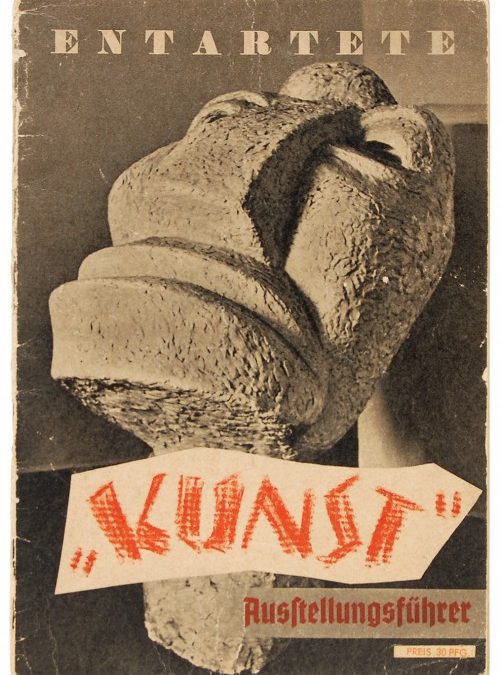
Programme for Entartete Kunst (Degenerate Art), first edition.
A rare survival, this is the programme that accompanied Entartete Kunst, the Nazi’s 1937 exhibition mocking “degenerate” avant-garde art. Targeting modern art, music, and literature was an important aspect of the Nazi campaign, and as early as 1930 museums were put under pressure to conform, with certain works taken off show and uncooperative directors removed. By 1933 the first defamatory exhibitions were being staged. “The purpose of this propaganda was the bringing-in-to-line (Gleichschaltung) of the arts within a Nazi state. Art’s only task was to illustrate the ideas of National Socialism and the glorification of the State” (MOMA).
These tactics culminated in 1937 with the widespread confiscation of art across Germany and the development by the Reichskammer für Bildende Künste (Reich Chamber of Visual Art) of the show Entartete Kunst (Degenerate Art) in Munich. The exhibition displayed works that were deemed insulting to religion, the state, or the German people; produced by Jews and other minorities; or evidence of foreign and “degenerate” influences such as modernism and expressionism, African culture, homosexuality, and communism. Pieces were crammed chaotically together in the exhibition space alongside derogatory graffiti-style comments and notes about how much the state had spent to obtain them. Among the 650 items were works by Otto Dix, Max Beckmann, Marc Chagall, George Grosz, Mondrian, Kandisnsky, and Paul Klee. Entartete Kunst became “the first traveling blockbuster show of the 20th century”, touring for two years across Germany and Austria and attracting 3 million visitors (Time). 1938 saw the opening of a sister exhibition, Degenerate Music, which targeted modern styles such as jazz.
Afterward, works that had been on exhibit in Entartete Kunst, along with thousands of other confiscated pieces, were added to party leaders’ personal collections or sold internationally, but many were publicly destroyed. (Philadelphia Museum of Art). The artists themselves were prohibited from producing new work. Those that could fled, while others continued working in secret and some Jewish artists were interned in concentration camps. Following the war a few items were found by the Russian Army and made their way to the Hermitage, and in 2010 several bronze sculptures from the exhibit were uncovered during the construction of an underground train line in Berlin. These were put on display partially restored, to emphasize both their original states and the damage inflicted during the war (Der Spiegel). The Entartete Kunst exhibition catalogue is rare on the market. An historically significant programme, it is a stark reminder of the fate of art and artists under totalitarian regimes.
“A very revealing racial profile…”
“Revelations of German religiosity…”
“‘Art’ preaches class struggle!”
“Painted sabotage of Otto Dix”
“The whore is elevated to a moral ideal!”
“Any comment here is superfluous!”
“Three samples of Jewish sculpture and painting…”
“Even this was once taken seriously and highly paid for!”
“Two ‘Saints’!”
“If an incurably insane dilettante made a cat…”
“Ignorance or stupidity – or both – to the extreme!”
E. O. Hoppé, nearly forgotten, was one of the most famous photographers of the early 20th century and a leading figure in the modernist movement who was described by Cecil Beaton as “The Master”. Hoppé was born in Munich in 1878 and moved to London in 1900 intending to train as a financier. Instead, he took up photography and quickly became a top celebrity portraitist, making images of the leading artistic, literary and political figures of the day. But Hoppé had a far-ranging eye and a deep intellectual concern with his subjects, and in addition to his celebrity work he made sensitive portraits of the poor and marginalised that challenged prevailing notions of beauty. He also traveled extensively, and his photography encompassed all aspects of life, from the ballet to industrial and urban scenes, landscapes, and images of life in the developing world.
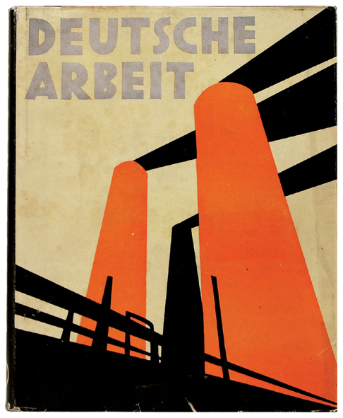
This beautifully produced book, Deutsche Arbeit (German Work) was the outcome of regular visits to German manufacturing cities during the 1920s, and it records the period’s unprecedented industrial build-up. These often eerie photos reveal the new scale of industry, with the human figures dwarfed by fantastical machines, and traditional forms revealed in strange new settings. Unusually, the book also features an eye-catching reversible dust jacket with a colourful design on one side (above) and a black & white photo on the reverse (below).
Reverse of the dust jacket for the first edition of Detusche Arbeit.
Despite his importance as a modernist photographer, Hoppé is relatively unknown today. In 1954 he sold his entire archive to a picture library that categorised the images by subject rather than photographer, and his identity vanished from the photographic record. His oeuvre has recently been reclaimed from obscurity and reunited with his letters and biographical documents, leading to a revival of interest in his work. London’s National Portrait Gallery is currently running an exhibition of 150 images entitled Hoppé Portraits: Society, Studio & Street (till 30 May 2011), with an excellent accompanying website. The official Hoppé website also hosts a very impressive gallery of photographs alongside descriptions of his original books.
One of the most rewarding aspects of the book trade is acting as a matchmaker between cultural institutions and historically significant items. At Peter Harrington we recently had the pleasure of securing a unique item for the Library of Congress: plans for the first medal produced by the United States, the Libertas Americana.
As the Revolutionary war turned in the favor of the Continental Army, Franklin routinely spoke of events in a mythological vein. In 1781, just after the battle of Yorktown, he wrote to John Adams “Most heartily do I congratulate you on the glorious News! The Infant Hercules in his Cradle has now strangled his second Serpent, and gives Hopes that his future History will be answerable”. The image was apt. Britain, the “mother country”, had sent armies into its colonies just as Hercules’s stepmother Juno had sent the snakes into his cradle.
With these sentiments in mind, Franklin conceived of the Libertas Americana as a way of commemorating the partnership between France and the United States. In March 1782 Franklin wrote to Robert R. Livingston, the Congressional Secretary of Foreign Affairs,
This put me in mind of a Medal I have had a Mind to strike since the late great Event you gave me an account of , representing the United States by the Figure of an Infant Hercules in his Cradle, strangling the two Serpents, and France by that of Minerva, sitting by as his nurse with her Spear and Helmet, and her Robe speck’d with a few Fleur-de-Lis. The extinguishing two entire Armies in one War, is what has rarely ever happen’d, and it gives a presage of the future Force of our growing Empire” (The Papers of Benjamin Franklin, XXV, 651).
The idea was approved and design work proceeded in France, with sketches being produced by Augustin Dupré, a goldsmith and medallist, and Esprit-Antoine Gibelin, a painter, draughtsman, and sculptor. Until now only three of the planning drawings were known: two signed by Dupré – one at the American Philosophical Society, the other at the Musée des Arts Décoratifs in Paris – and one by Gibelin in the collection of the Musée Nationale de la Coopération Franco-Américaine at Blérancourt. This newly discovered sketch is the earliest extant design, referred to in a letter of September 1782 to Franklin from Alexandre-Théodore Brorongniart, the King’s Architect, who wrote “I have obtained at last two rather large sketches for the medal from the sculptor whom I had the honour to speak to you about…”.
Comparison of all four designs suggests a clear chronology in the development of the medal and its symbolism:
Above, the initial design for the Libertas Americana, now in the collections of the Library of Congress. Hand-rendered en grisaille over a base of sepia wash with fine inked detail. This piece was most likely executed by the artist Esprit-Antoine Gibelin, as it is consistent in style and execution with his other classical studies.
Second sketch by Gibelin, probably a preparatory design for the engraver or die-maker, which is why the shading has been removed and the lines toughened.*
Sketch by Augustin Dupré, who was assistant engraver at the Royal Mint in Paris and joined the project in that capacity part-way through the planning process. This image incorporates some artistic changes, though not all would be retained in the final design. Note that that cradle has been replaced by a shield, representing the military origin of the new nation. The loose quality of this sketch indicates that it was a working drawing, probably produced during discussions of how to best render the design in metal.
Sketch by Augustin Dupré now held at the Musée des arts décoratifs in Paris. The final extant design drawing, with all elements of the finished medal in place and the image reversed for the production of the medallic die.
A completed medal, in bronze (via PCGS). The dates at the bottom are those of the battles of Saratoga and Yorktown.
This series of images beautifully demonstrates the ways that Franklin and his artists conceived of the medal, and how their design decisions related to its role as a political gesture. For instance, Franklin initially stated that he saw France as sitting beside the child, but quickly decided that this made the nation seem too passive, devaluing its role in the war. So a lion was added, even though it doesn’t appear in the original myth, so that France could be shown in actively protecting the infant nation. Though not too actively. It was important to make it clear that the Colonies had initiated the war and done the heavy lifting in defending themselves – hence the change to a low and defensive position for Minerva’s spear rather than a raised position of attack. Even seemingly trivial details such as the location of the lion’s tail were of concern – the tail between the legs was chosen to indicate cowardice on the part of Britain while making France seem less aggressive. The overall statement is gratitude for France’s vital military and financial support, while demonstrating the emerging power of the United States, which was able to defeat Britain with its own hands.
An unknown number of the medals were stamped in bronze and silver and given to generals, congressmen, ministers and other important figures in France and the United States, and gold examples were presented to the King and Queen of France. Additionally, Franklin sought to distribute the imagery itself via published accounts in newspapers and other sources. Despite sniping at home from some leaders, such as John Adams, Franklin’s gesture is considered to have been masterfully managed. With it he achieved the recognition of America’s fortitude, gratitude, generosity, and prowess at arms that he had sought, and placed her as an independent entity on the stage of international politics. Superbly composed, beautifully engraved, and above all scarce, the medal remains one of the most desirable American commemoratives, with a silver example making $115,000 at auction in 2005.
The Libertas Americana is a delicate symbolic balancing act and an elegant statement of Franklin’s feelings at the conclusion of the war. The original drawing represents a discovery of undeniable importance in numismatic and historical terms, and we’re thrilled to have guided it to its new home at the Library of Congress.
*The images of the three later medal designs are taken from Lester C. Olson’s excellent Benjamin Franklin’s Vision of American Community: A Study in Rhetorical Iconology (University of South Carolina Press, 2004).


Recent Comments